Tropical Modern

I live in north Florida.  Some around here call it “south Georgia,” and only half in jest.  Not that I dislike a nice traditional building in the Neoclassical or NeoGeorgian style.  I’ve designed numerous buildings with Doric columns and red brick veneer.

But every now and then I like a good Modern design.

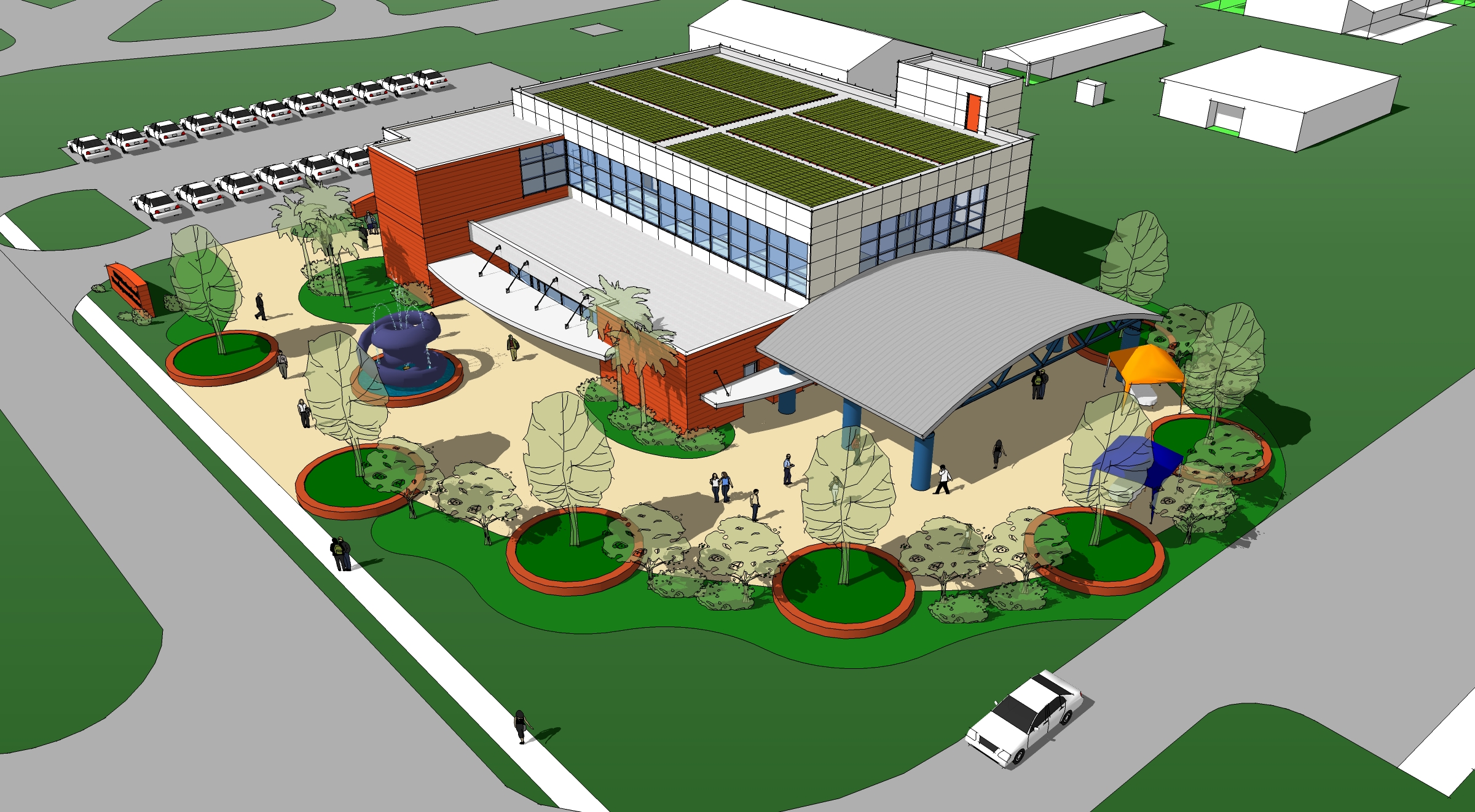
So when my old company, McCullar & Boatright Architects, decided to build a new office for ourselves we decided it should be Tropical Modern.  Friends of ours, Joe and Beth Mittauer wanted to build neighboring buildings simultaneously with one homogenous design.  This allowed us to dream big.

We purchased a parcel on Wells Road right where Al Capone used to have his horse track.  When the property was cleared you could still see the impression of the banked southwest turn.  So we called our investment group The Horsetrack of Wells Road.

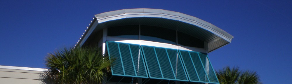
After several drafts we settled on two buildings with a courtyard separating them.  The buildings are constructed of tilt-up concrete slabs, steel columns and roof structure covered with modified membrane roofing and curved standing seam aluminum roof panels.

RenderingThere are several tenant spaces in both buildings.  Our investment group took the northern building, 590; and the Mittauers took the southern building, 580.  We share a parking lot and the courtyard, which serves as the entry for most of the tenant spaces.

The landscaping was designed by the landscape architect, David Johnson, a friend of ours.  We requested a low maintenance design that highlighted native Florida plants and other types that helped create the tropical feel.  Of utmost importance to me was the use of Sabal Palmettos, our state tree.

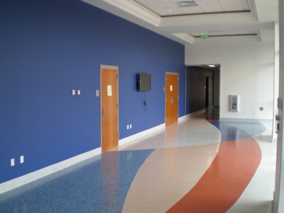
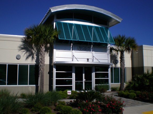
The interior served as a showcase for several ideas and experiments.  We wanted to carry the modern theme throughout the interior and to create subtle deviations from expected elements.  Beginning with the entry, we vaulted the space to bring all the light in through the louvered entry glass.  The lobby never needs additional lighting during the day.

It is difficult to capture the lobby height in a single photograph.  At the entry you will see that the ceramic tile is angled as a 60:40 angle, a nod to the old drafting triangles of our recent past. The conference room has a glass wall separating it from the lobby, but we used a frosted film to prevent the dreaded “fishbowl” effect.  Again we exposed the structure, as we had in the lobby, to display the skeleton of the building.

The dark green wall was designed as a presentation area, and the white wall on the back right is a barn door with a white laminate that serves as a marker board, projection screen, and place to tape drawings during meetings.  The lighting uses indirect natural color lamps to aid in material selections.  Behind the sliding/rolling barn door is the materials and sample library from which we bring out items for meeting with clients.

As we move into the “bull pen” we let ourselves have some fun.  Rather than creating ordinary drafting cubicles, we opted for angled walls to add some flair.  There are multiple levels of lighting available in the space, convenient for CAD drafting on computer monitors.  The large windows to the rear face northeast and the intersection of Wells Road and Eldridge Avenue.  A large layout table in the center of the room is sized to hold multiple drawing sets and features flat file cabinets on one side for current projects and bookcases on the other for codes and manuals.

The architect offices on the north side have that perfect north lighting for art work, and feature full glass walls and 8-foot doors that allow the borrowed light to filter into the rest of the bull pen area.

Besides being a wonderful place to work, it has turned out to be a terrific showcase for design ideas that were used in subsequent projects.  Goes to show that sometimes you just have to do it yourself first before people will appreciate it.

LEED Gold for Updated Collegiate Gothic

One of the projects I was fortunate to develop for my alma mater was a conference center and office building for IFAS (Institute of Food and Agricultural Sciences), the Straughn IFAS Professional Development Center.  Located on the south side of the University of Florida campus, near the veterinary college, it was a perfect site for an agricultural institute.

This project houses three meeting rooms that can be combined into a single larger meeting room capable of seating more than 300 people. A large covered outdoor classroom also seats 300 people. The meeting room area also serves as a hurricane shelter during emergencies. The second floor of the building is an office area for the 4-H administrative department consisting of more than 15 offices, two large conference rooms and associated work areas.

As always, I started by trying to “push the envelope” of design.  And this was one project I developed almost entirely in SketchUp before moving into traditional 2D CADD.

This was a little too far out there, though I really like the auditorium layout with the scalloped walls for acoustic control.  So we started compacting the building and making the mass simpler.

This was more in-line with what the client had envisioned and I pursued this massing in more detail.  I tried merging some exterior hardscape and landscaping ideas into the design.

This looked a little too industrial to the client, so we opted for brick veneer to match the majority of UF campus buildings.

The University definitely wanted the UF collegiate gothic style to be reflected in the new building, even though it was some distance from the historic campus center. Here is the final rendering that was approved for completing the construction package.  Note that there were dozens of intermediate sketches used to tweak the design as we sought to capture the client’s wishes.

Rendering by David W. Shepard

The landscaping was ultimately design by UF’s environmental horticultural program, led by Dr. Gail Hansen, and used as a Demonstration Garden teaching tool to demonstrate LID (low impact design), rainwater harvesting and xeriscape plant selection. You can see how closely the final building matches the design rendering (note that landscaping is always rendered at a 5+ year growth).

A close-up shortly after completion.

The building is two-story and uses ICF (insulated concrete forms).  We used brick veneer to fit in with the campus and precast concrete coping, brick pediment and precast concrete arch voussoirs and imposts to emulate the historic collegiate gothic style on the UF campus.

The interior design featured terrazzo flooring in a pattern I developed to signify movement through the building and progress through the history of IFAS.

The primary donor for the project was Dr. Alto Straughn and his wife Patricia, a member of the Florida Agricultural Hall of Fame and an innovator in developing and improving Florida’s blueberry crop.  The dark blue wall and blueberry sculptural medallion on the entry arch was in homage to his contribution.  The orange and blue colors of the University of Florida were woven into the pattern in the terrazzo.

The project was completed in early 2012 and was at that time considered among the most energy efficient buildings on the campus. The ICF walls provide a durable structure (for the hurricane shelter aspect) and superior insulation. Wall insulation exceeds R-21 and roof insulation exceeds R-40, resulting in an energy efficient envelope. HVAC is provided through a rooftop-mounted, variable-air volume unit using evaporative cooled condensors.

This is an example of achieving a Gold certification without using any “exotic” sustainable technologies.  There are no rooftop gardens, solar panels or other on-site energy generation.  Careful selection of materials, attention to the building envelope and insulation, careful design of mechanical and electrical systems all contributed to the rating achieved.

Project Information
Area: 15,500 GSF
Cost: $3,122,519
Contractor: The Brentwood Company, Inc.
Client:  University of Florida
Client Project Manager: William Smith
LEED Certified: Gold, 12/18/2012


In the beginning…

I’d liked to say I played with Fröbel blocks in my German kindergarten like Frank Lloyd Wright.  Instead I played with LEGOs.

Or that I was awed by the Acropolis in Athens when I was five.  Actually I was just looking for the lost button from my little blue “reefer” blazer.

But I think it was staying with my grandparents in Live Oak, Florida, that started my love of buildings.  They had a classic four-square Cracker house with a tin roof that they built themselves after clearing a place in the piney woods.  It had a dirt yard, chickens, hogs, cows, sugar cane (for cane syrup), and tobacco.

I loved hearing the sound of rain on that tin roof.  The rooms were tall, as were the double-hung windows.  Grandpa and Grandma would rock in matching chairs on the front porch while the family sat all around. We listened to crickets, watched the heat lightning in the distance and caught lightning bugs in the woods next to the house.

I struggled with my Master’s degree thesis, going through a highly detailed and an exhaustingly researched premise that architecture could solve cabin fever in hostile environments (space, undersea and Antarctica).  Much as I enjoyed the research, it would have needed at least five books to do it justice and I was interested in graduating.  I briefly considered an urban planning concept that transformed the surburbs into walking areas with mingled work places and homes (this was pre-Seaside and New Urbanism).

However what I settled on was a design concept that I did for a class project.  The project used an international housing competition for the design parameters and requirements (easier than coming up with one from scratch). The goal was a 1,200 SF home that could be built for under $75,000.

The trend to strange modern houses with weirdly pitched roofs did nothing for me.  I wanted to capture the Cracker house that meant so much to me.  The Cracker style is called “vernacular” because it was designed without architects, based on generational cultural memory.  It’s complicated.  You can rent my thesis from the University of Florida if you need a cure for insomnia.

I also liked modular designs that could grow according to the needs of the homeowner.  I came up with an 862 SF base module that contained the basic required spaces:  living room, dining room, kitchen, laundry, master bedroom and master bath.  I opted for a two-story house to minimize the footprint and maximize the use of the land.  Then I added a double-bedroom module that also included a shared bath.  This brought the square footage to just under 1,200 SF (1,198 SF).  To keep costs down, I did not include a garage.

I designed the house so that it could be combined into zero lot line houses, multifamily units or townhouses.  And I had versions that could further expand the house into 1,728 SF “Plantation” style (wrap-around porch), 2,065 SF expanded living room (“great” room), and a 1,537 SF 5-bedroom model.

My professor encouraged me to submit my project to the competition.  I was late and my other classmates had long heard back from the organizers that their entries had been received.  I had heard nothing, so I assumed it was lost in the mail.  Oh well.

So I was surprised when late one evening I got a call from the organizers on the West Coast.  I asked if they received my entry.  They said they did, and I won the Grand Award.  First place out of 375 international entries.  The prize was $5,000 and they would build a model in Tacoma, Washington.  I was stunned.  I was still in graduate school and working construction summers for a design/build firm.  I used the prize money to purchase my first computer:  an IBM PC, First Generation.  It cost $4,500, had no hard drive, a full-size floppy drive (for 4″ floppies), an amber monochrome monitor, and 640 KB of RAM.  Using a copy of WordPerfect, version 1, and AutoCAD version 1.1, I wrote my thesis expanding on the project and exploring the roots and origins of vernacular design.

Innovation in Housing 1985 Grand Award house, Tacoma, WA

Innovation in Housing 1985 Grand Award house, Tacoma, WA. Photo by Chris Eden.

The plans for the house were sold through Better Homes & Gardens (one of the sponsors of the competition) and I enjoyed some small royalties that certainly came in handy for buying day-old bagels to steam on my college hot plate.

You’ll notice in the photo of the Tacoma house that they did some odd things that we just don’t do in Florida:  wood shake roof and wood foundation (they must not have termites in Washington state).  They had me add a garage to make the plan more marketable.  Even with all this, it was built in 1985 for $67,500.  Well under the competition maximum of $75,000.

It was almost 20 years later when a friend in Orange Park told me how he loved that design and asked to build it for his home a couple of blocks from my own.  It was a treat to see it built (I never got to see the model built in Tacoma).

Dinkins Residence, Orange Park, FL

Dinkins Residence, Orange Park, FL

Ben Dinkins, the owner of the house in Orange Park, had an investment opportunity and a vision to create low cost, high density housing in Orange Park. So we worked together to create a community of houses based on the “Flexible Vernacular” design.  He called the project Kingsley Junction (next to the old railroad station) on Corduroy Road.  Fortunately he paved the road, so it was not a true country corduroy road.

Corduroy Road development, Orange Park, FL

Corduroy Road development, Orange Park, FL

Corduroy Road development, Orange Park, FL

Corduroy Road development, Orange Park, FL

We created three different models, and made a concession to modern taste in providing a single car garage.

It was a fun project.

That original 862 SF base home has stuck in mind over the years.  It has led to a continuing interest in tiny homes.  Recently I have begun to research ADUs (Accessory Dwelling Units).  These are appearing in increasing numbers around the country as guest houses, or “grandparent” homes beside larger homes.  With the graying of America I think this will become an increasingly important trend.